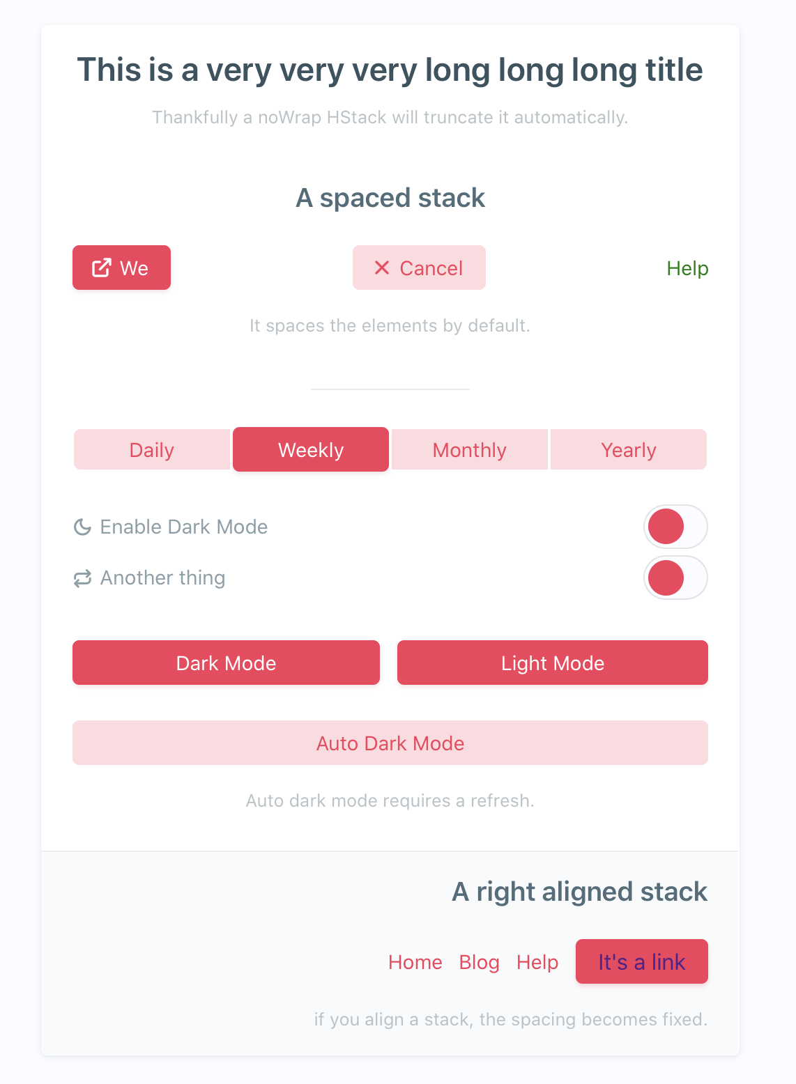
As part of the development process of Mailbrew, we created a React components library to streamline the work on the frontend and start sharing components between projects.
This started with the simple goal of stopping reimplementing the same components (layout, typography, buttons) from scratch in each project. We achieved this goal and then some, by creating a library that allows us to easily implement a design system.

To give you an idea of the power of this library, we were able to go from design to live website for mailbrew.com (a Gatsby website) in just one day, and at the end we had produced a configuration file describing the design that we were able to reapply to the React web-app app.mailbrew.com (a separate project) by just copy-pasting the configuration, obtaining the same visual language in both projects with minimal effort.
Configuration
Spacings, colors, sizes and constants in general are at the core of any design system. Using few of those, consistently, makes wonders for polishing a design. In our ui kit, all these values reside in the configuration (config for short).
Each component reads from the config to set its defaults. The library provides defaults for all values in the config, overridable by the config of the project, or by props passed to the components.
The config becomes also a place for other project constants to easily be reused in project-only components.
The config is a simple JavaScript object, with some superpowers that allows for dynamic self-references:
const config = {
  colors: {
    background: "#fff",
    accent: "#f00",
  },
  buttons: {
    background: (c) => c.colors.background,
  },
};
In the example above we define a config with two colors, and button's backgrounds. Should the colors change (maybe because of a switch to dark mode), all the buttons would update accordingly following the new palette.
This config is accessible from all components with a single hook.
const Component = (props) => {
  const config = useConfig();
  const { colors } = config;

  return <p style={{ color: colors.accent }}>Hello world</p>;
};
The config is overridable. The ui kit provides a default config that the project overrides when needed. Even a project with empty config will look good.
const App = () => {
  <UIContextProvider configOverrides={config}>
    <IndexPage />
  </UIContextProvider>;
};

const IndexPage = () => {
  const updateConfig = useUpdateConfig();

  const handleSwitchToDarkMode = () => {
    // some darker colors
    updateConfig({
      colors: {
        background: "#fff",
        accent: "#f00",
      },
    });
  };

  return (
    <>
      <Button onClick={handleSwitchToDarkMode}>Switch to Dark Mode</Button>
    </>
  );
};
Stacks
I have been an iOS developer for years and took the idea of stacks from the recently released SwiftUI to the web. Stacks come in two forms, horizontal (HStack) and vertical (HStack) and allow to easily layout content in both directions. They abstract over Flexbox and allow to set the gap between the contained elements easily, something you can’t do with the current version of Flexbox (at the container level):
<VStack gap="0.5em">
  <HStack gap="1em">
    <H1>Boxy Suite</H1>
    <H2>Gmail and G Suite as beautiful Mac apps</H2>
  </HStack>
  <Button>Check it out</Button>
</VStack>

Typography
We defined a few elements here: headers, paragraphs, labels, badges. They all follow some generic config to make the sizing and spacing consistent. The naming follows the one of standard HTML elements, capitalized, so they are pretty easy to use.
<H1>This is a big header</H1>
<H2>This is a biggish header</H2>
<H3>This is a medium header</H3>
<H4>This is a small header</H4>
<P1>Paragraph text goes here</P1>
<P2>Smaller paragraph text goes here</P2>
Icons
We built our own icons library, based on the amazing work Gaddafi Rusli did with Icon SVG.
It's super-easy to use:
<Icon name="cloud">
The cool thing is that stroke width and icon size are configurable via props, so this makes for a very seamless experience. These icons are also used in other components, so that if I wanted to use an icon on a button I could do something like this:
<Button icon="twitter">Follow me</Button>
![]()
Take a look for yourself
This is just a glimpse of what we built, to get a better idea of it you can take a look at our example project.
I would like to know if this is something you would be interested in for your own projects, since we are considering open-sourcing this and making it widely available.
Let me know what you think on Twitter.